Pulze
A couple of years, Hamish worked at Live & Breathe agency, helping Imperial Tobacco develop an end-to-end digital strategy for their heated tobacco brand, Pulze. Starting with launches in Greece and the Czech Republic, the brand later expanded into six more European markets. It was one of my favourite projects to work on, particularly because it was in the digital space and something completely new to us as an agency.
Working alongside Executive Creative Director James Hoxley and Associate Creative Director Michelle Connolly, our goal was to overhaul a poorly designed website and boost brand visibility to support revenue growth and expansion.
We evolved the visual identity and rolled it out across the website, social media content and email newsletters – creating consistency at every touchpoint and setting the brand up for success.

Identity development
We started by pullling together all existing brand assets, including core fonts and colours. This was our starting point to begin building out a new identity to help re-position the brand online as a premium smoking device.
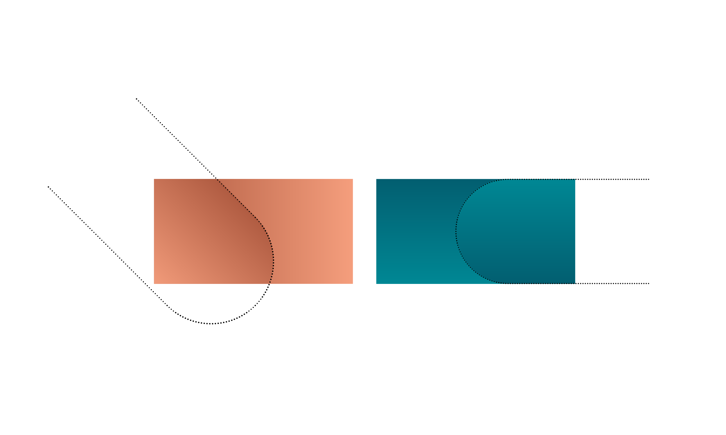
Shape Integration
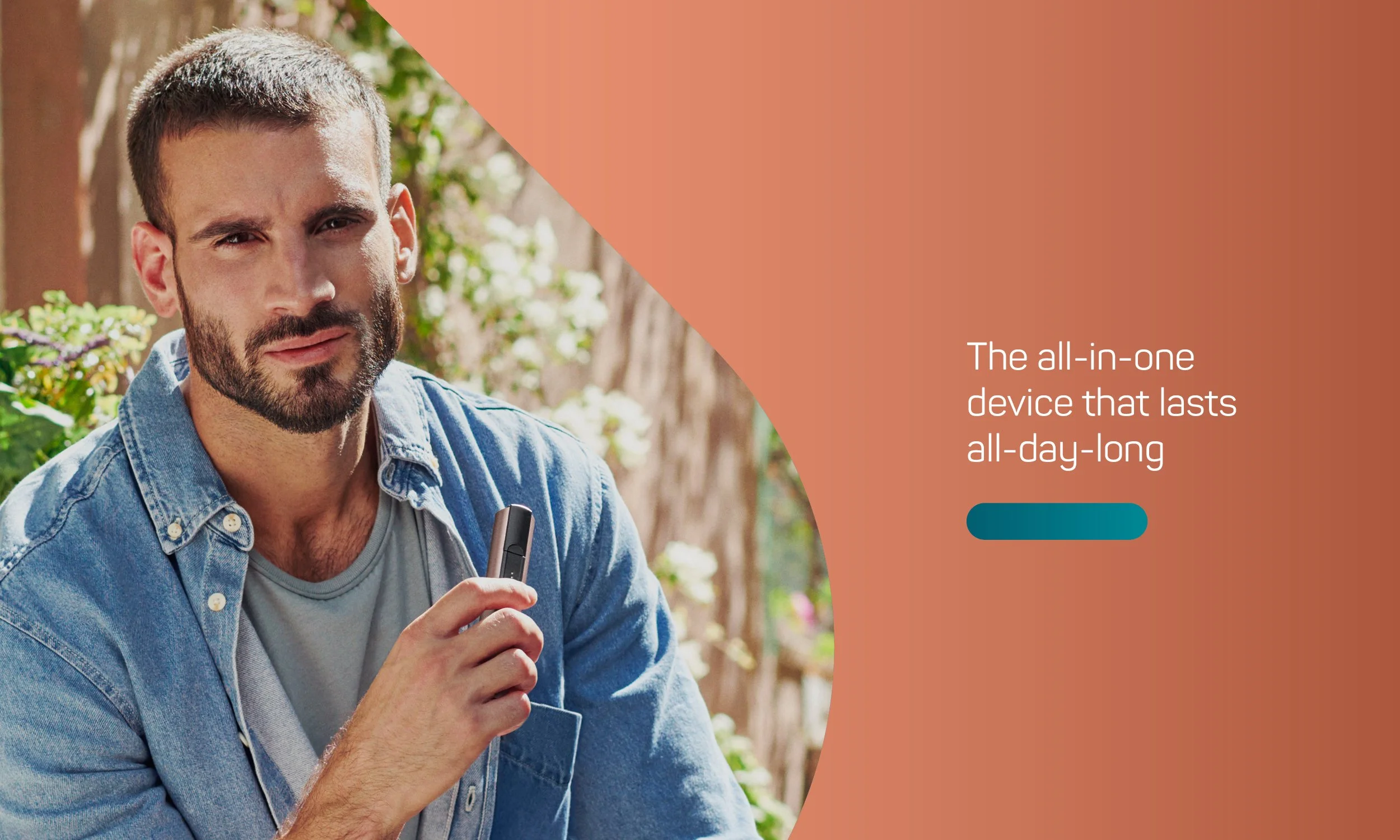
By using the ‘skateboard’ shape and the gradients from our brand colour palette we can build a dynamic design system.
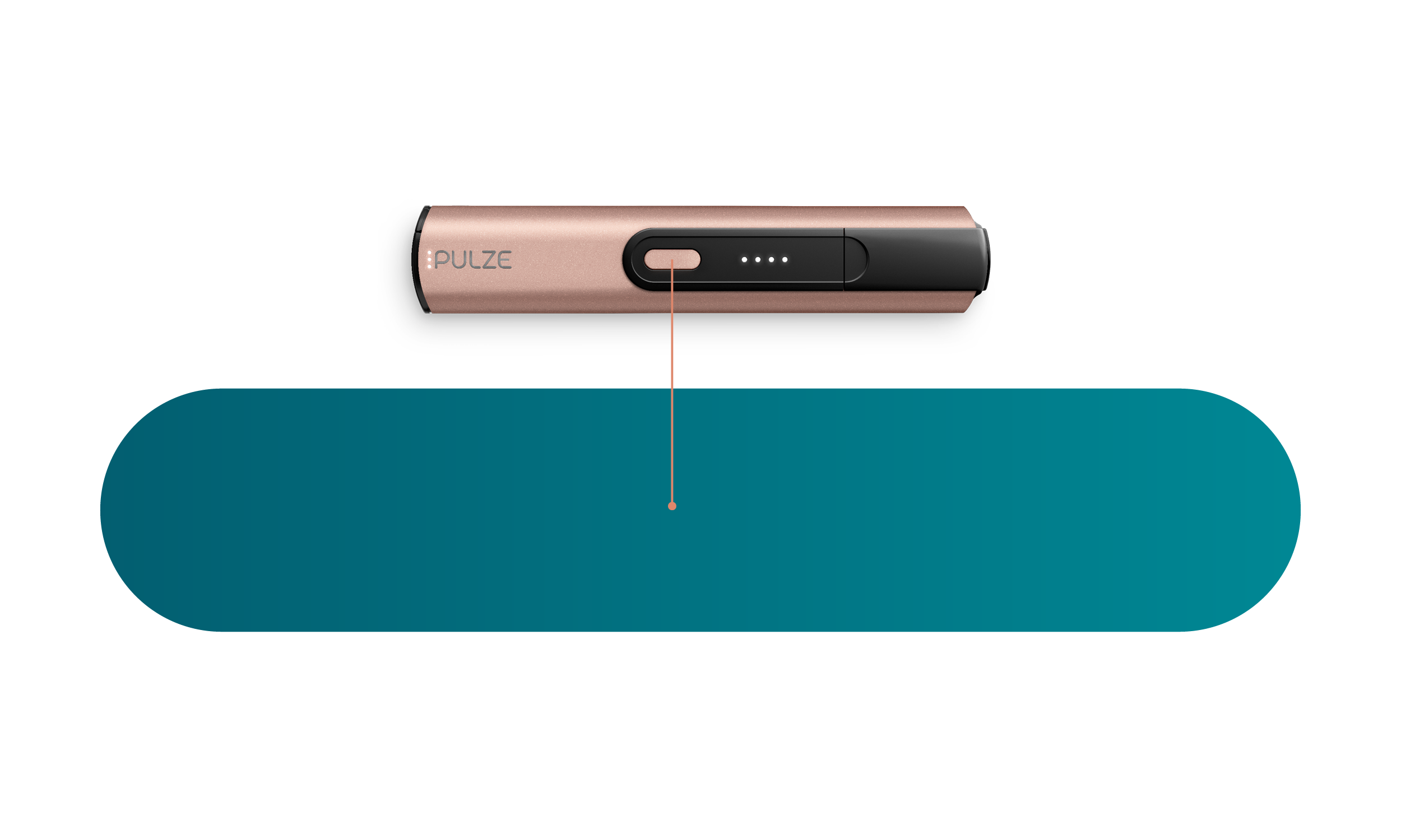
The Skateboard Shape
The skateboard shape is fundamental to the visual identity and is inspired by the device button. The skateboard shape is a strong brand asset that is integral to the digital ecosystem and integrates on and off-line communications.
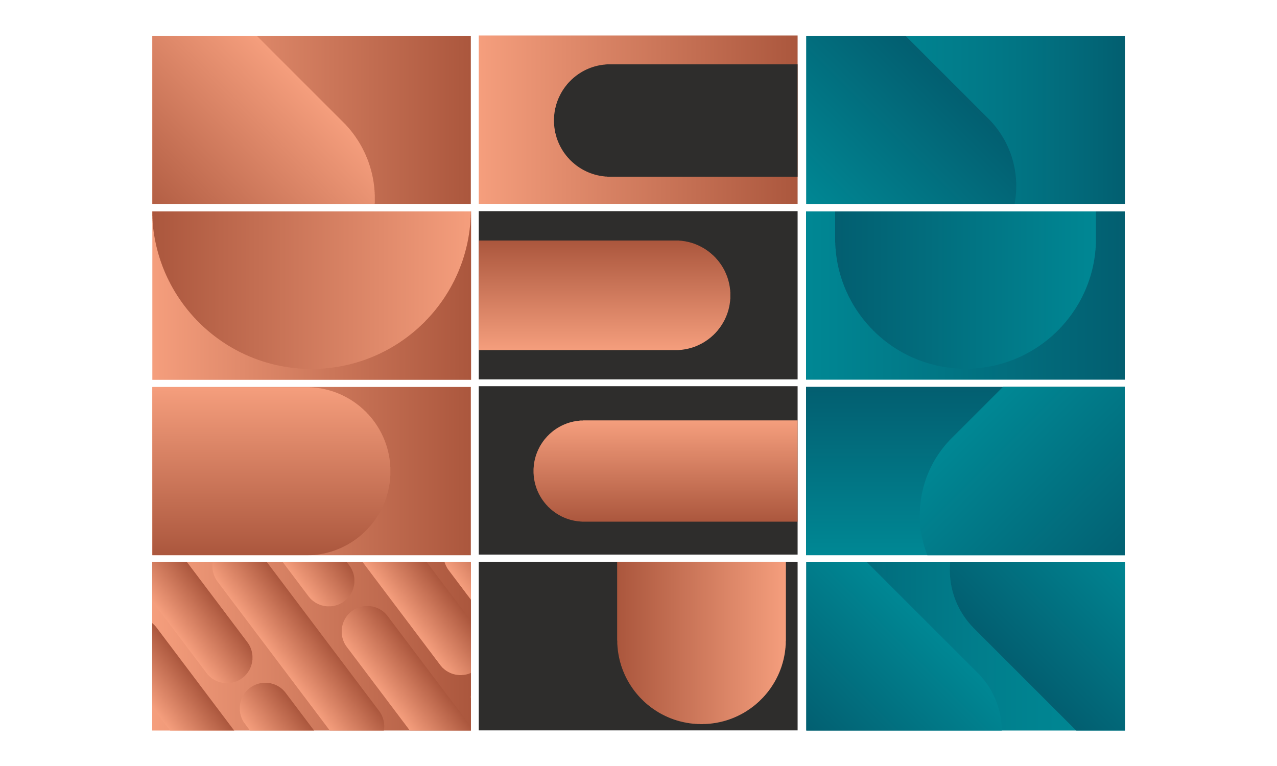
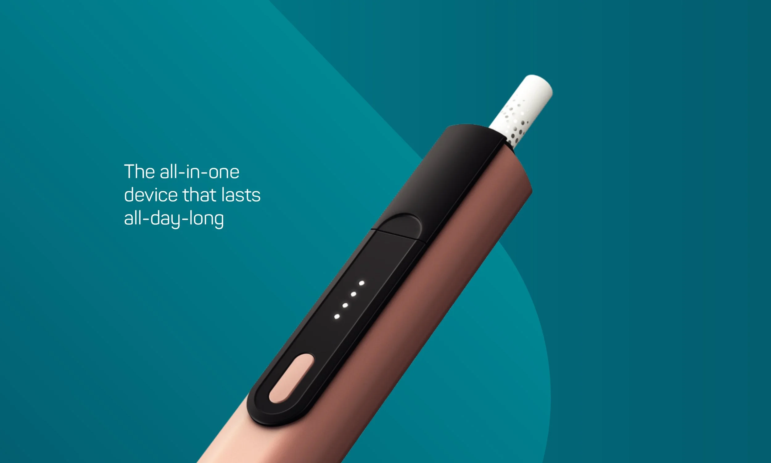
The Design System
By incorporating the core gradient colours into the skateboard shape and the background, we begin to develop an interesting brand world with no limits.
The design system is a great device for holding products, imagery and other information.
The design system creates a series of assets to be used across all digital touch points. It also creates a strong design language to use in retail through comms and fixtures.
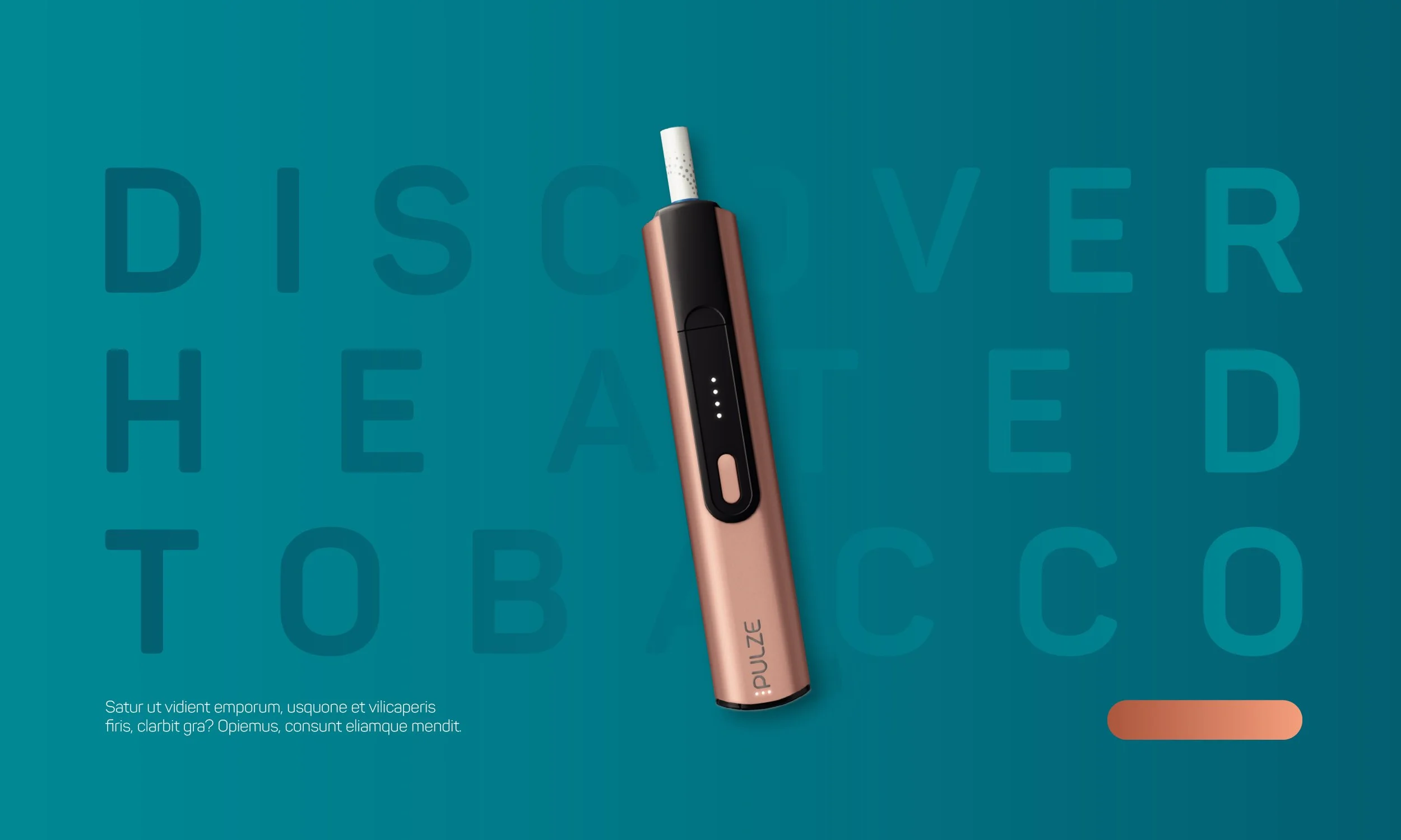
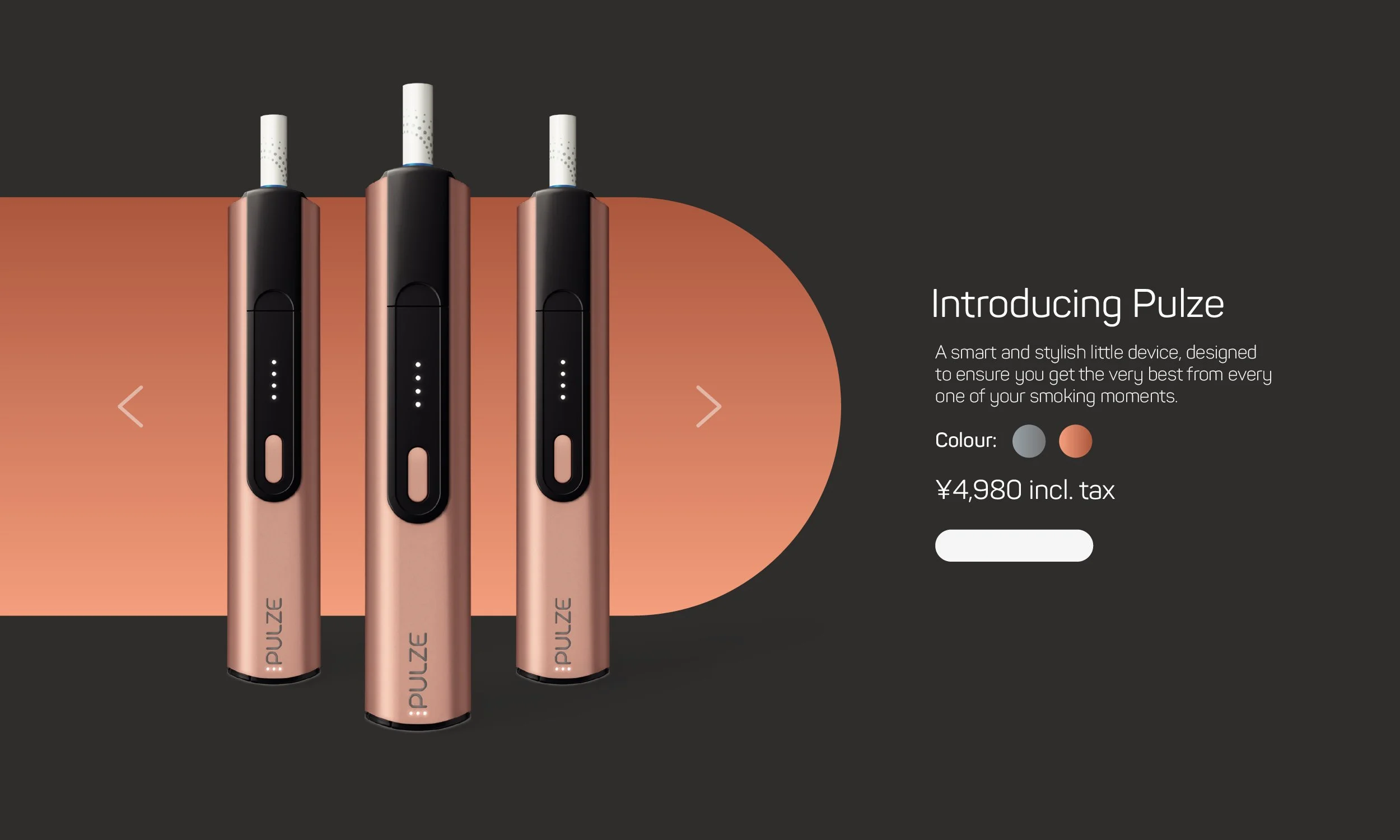
Key Art
Here we bring the product and imagery to life by incorporating it with the new design system. The key-art provides an insight on how different components or content can look at across various touch-points.


Website
Working alongside a team of developers to translate the web design into a real working site, we used Figma to prototype each page and build a customer journey flow.
Each page was designed for various formats, prioritising mobile, to help determine pixel perfect specs which are then used by the developers to build out the pages.
The skateboard identity was weaved into various components throughout the website to keep consistent with the new look & feel. Website designs currently for both Greek and Czech markets
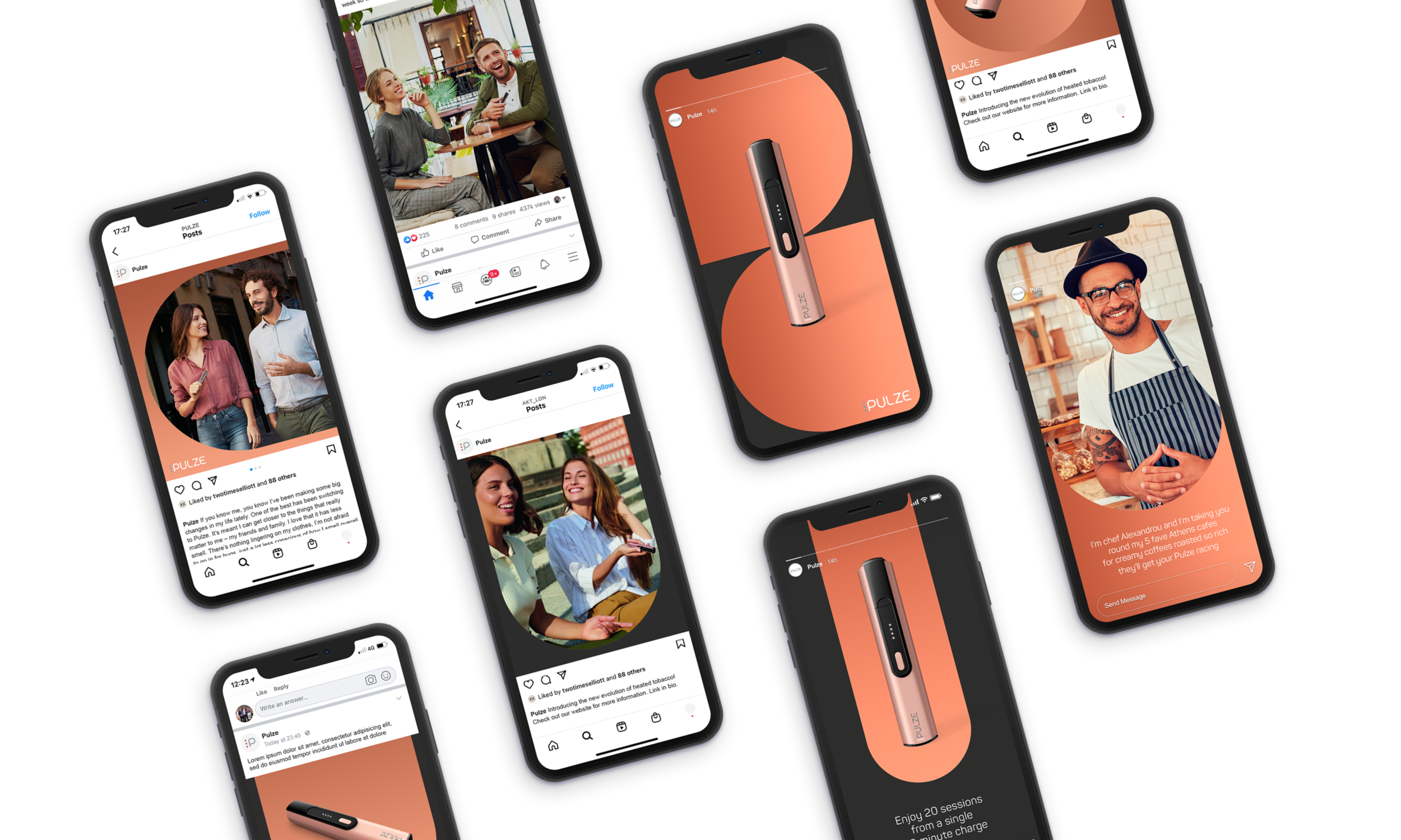
Social Media
Social media plays a huge role for Pulze by targeting their audience through paid ads and keeping them visually engaged on their social pages, through the use of static imagery and motion video. The social profiles for each market has been designed with the new look and feel in mind to give Pulze a solid online presence and to add maximum standout in feed.
The social assets consist of 3 categories, branded, semi-branded and non-branded to allow for a flexible toolkit which can be adapted with ease.
Branded
This post is designed in the full brand visual identity. The post will often featuring product or a headline.
Semi-branded
This post uses the Pulze skateboard shape to maintain an iconic link to the brand, whilst providing space for imagery.
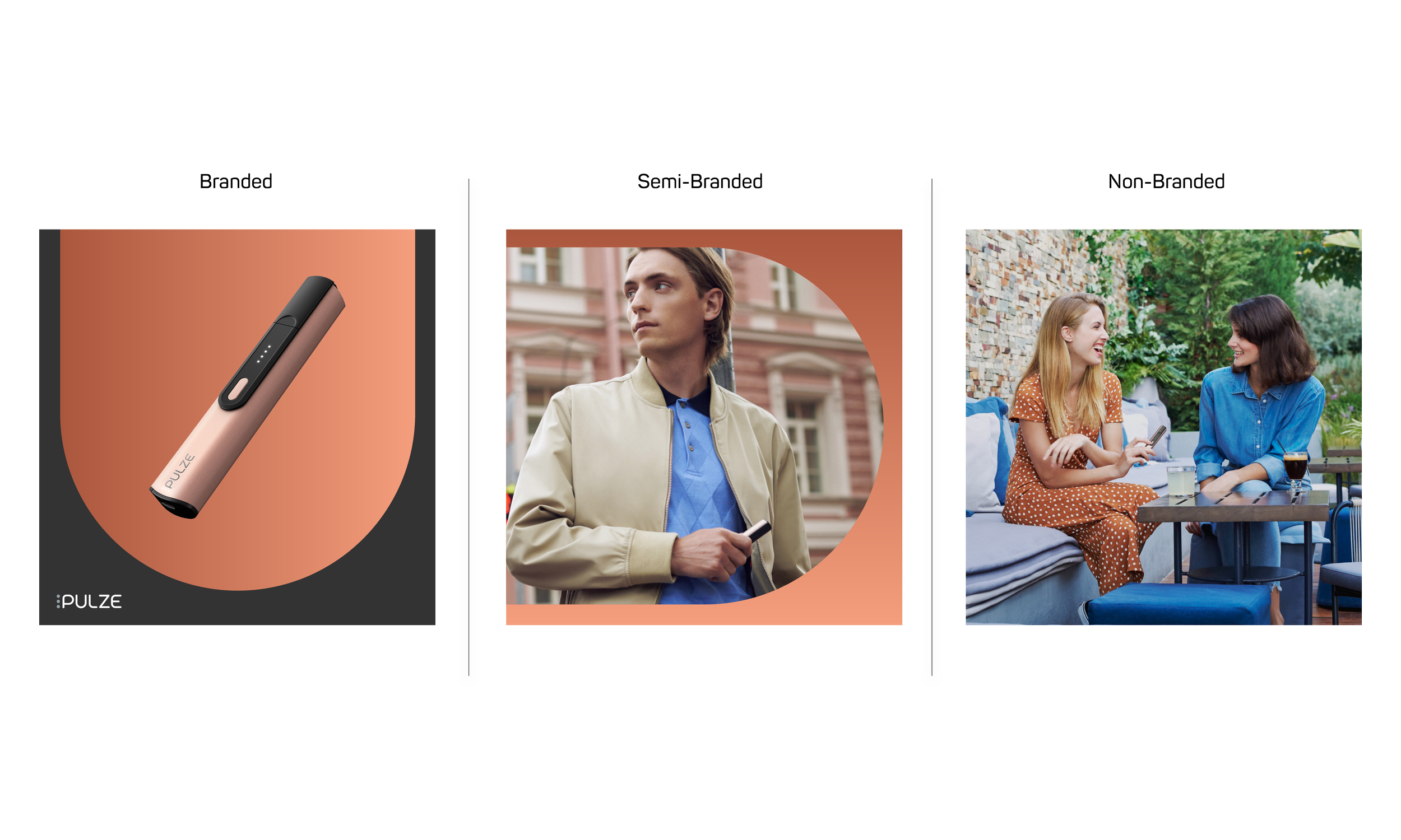
Non-branded
This post uses the Pulze skateboard shape to maintain an iconic link to the brand, whilst providing space for imagery.

eCRM
Pulze use a variety of newsletters to keep customers engaged with the brand and update them on the process of their order, using a series of follow-up emails. The newsletters are built in Optimove, using a simple build process. We have created a selection of custom assets to use within Optimove to help tie the newsletters to the brand ecosystem and keep in line with the new look & feel.